


How to create custom Dialog in LibGDX
Sun, 25 Feb 2018
This article describes how to programatically create a custom dialog using LibGDX framework.
Check out Lines Galaxy Android game to view the results in action.
LibGDX tutorials describe how to achieve this using graphic resources packed in a sprite together with a skin.
The test resources can be found here but for this specific task you'll only need the following ones:
You would just load the skin with all its assets (9patches, fonts, atlas with sprite) and pass it to the Dialog constructor:
Skin skin = new Skin(Gdx.files.internal("uiskin.json"));
// fire up the dialog and voila :)
Dialog d = new Dialog("Title", skin);
This will work for most scenarios.
However, I wanted to programatically be able to change the dialog properties and style.
_Notice: this tutorial only covers a dialog that uses the following elements: title, description, spacing, buttons, background and stage background; for all other items (checkbox, scrollbar, select) you're better off using images for each component.
_
The Prerequisites
Following code sequence contains the mandatory styles for the Skin object much needed in the Dialog.
// This is the Skin that we'll use to design our dialog
Skin skin = new Skin();

// We have two backgrounds to handle and two possible approaches depending on the design you need
// Using a 9 patch (it can contain the header of the dialog)
TextureRegion texture_region = App.res_atlas.findRegion("9patch_bg");
Sprite sprite = new Sprite(texture_region);
NinePatch np = new NinePatch(sprite, 15, 15, 15, 15);
NinePatchDrawable npd = new NinePatchDrawable(np);

// Using a Pixmap
Pixmap dialog_sbg = new Pixmap(App.screen_width, App.screen_height, Pixmap.Format.RGB888);
dialog_sbg.setColor(new Color(Color.BLACK.r, Color.BLACK.g, Color.BLACK.b, 1f));
dialog_sbg.fill();

// The only mandatory resource required for a Dialog is the WindowStyle
Window.WindowStyle ws = new Window.WindowStyle();

// We're using the 9patch drawable as the dialog element background
ws.background = npd;
// For the whole screen dialog background we're using the pixmap
ws.stageBackground = new Image(new Texture(dialog_sbg)).getDrawable();
ws.titleFont = App.manager.get("droidsansmono-regular-11.ttf", BitmapFont.class);
ws.titleFontColor = Color.RED;

// This WindowStyle needs to be set as the default style in the skin
skin.add("default", ws);

// We can now init the Dialog
final CustomDialog cd = new CustomDialog("", skin);
We now have the Skin ready with a black fullscreen background and a grey window.
The CustomDialog Class
I've wrapped the Dialog in a CustomDialog class. This allows me to set the dialog properties once and then reuse the same dialog without a new setup.
public class DialogAlert extends Dialog {

    private float dialog_width = (float)(260*App.density);
    private float dialog_height = (float)(180*App.density);
    private float dialog_padding = (float)(20*App.density);
    private float button_height = (float)(40*App.density);
    private float button_width = (float)(200*App.density);
    private float button_pad_h = (float)(15*App.density);

    public DialogAlert(String title, Skin skin) {
        super(title, skin);
        setup();
    }

    // Set certain sizes and options
    private void setup() {

        padLeft(dialog_padding);
        padRight(dialog_padding);
        padBottom(dialog_padding);
        getButtonTable().defaults().height(button_height);
        getContentTable().defaults().width(dialog_width);

        setModal(true);
        setMovable(false);
        setResizable(false);

    }

    // Set the properties of the description Label
    @Override
    public DialogAlert text(String text) {

        Label label = new Label(text, new Label.LabelStyle(App.manager.get("font-11.ttf", BitmapFont.class), Color.WHITE));
        label.setAlignment(Align.center);
        label.setWrap(true);
        label.setWidth(dialog_width-dialog_padding*2);

        text(label);

        return this;

    }

    // The "YES"
    // In my case I wanted it to be slightly more pronounced so I used a basic 9patch
    public DialogAlert buttonYay(String buttonText, InputListener listener) {

        TextButton.TextButtonStyle textButtonStyle = new TextButton.TextButtonStyle();
        TextureRegion regionOn = App.graphics_atlas.findRegion("button", 1);
        Sprite s = new Sprite(regionOn);
        NinePatch onNinePatch = new NinePatch(s, 14, 14, 14, 14);
        NinePatchDrawable ninePatchDrawable = new NinePatchDrawable(onNinePatch);

        textButtonStyle.up = ninePatchDrawable;
        textButtonStyle.down = ninePatchDrawable;
        textButtonStyle.checked = ninePatchDrawable;
        textButtonStyle.over = ninePatchDrawable;
        textButtonStyle.disabled = ninePatchDrawable;
        textButtonStyle.font = App.manager.get("font-15.ttf", BitmapFont.class);
        textButtonStyle.fontColor = Color.WHITE;

        TextButton button = new TextButton(buttonText, textButtonStyle);
        button.setSize(button_width, (float)(44*App.density));
        button.addListener(listener);
        button.padLeft(button_pad_h);
        button.padRight(button_pad_h);
        button(button);

        return this;

    }

    // The "NO" button has a different design compared to the "YES" button
    // In this example it's a transparent background with a white text
    public DialogAlert buttonNay(String buttonText, InputListener listener) {

        TextButton.TextButtonStyle textButtonStyle = new TextButton.TextButtonStyle();
        textButtonStyle.font = App.manager.get("font-15.ttf", BitmapFont.class);
        textButtonStyle.fontColor = Color.WHITE;

        TextButton button = new TextButton(buttonText, textButtonStyle);
        button.setSize(button_width, (float)(44*App.density));
        button.addListener(listener);
        button.padLeft(button_pad_h);
        button.padRight(button_pad_h);
        button(button);

        return this;

    }

    @Override
    public float getPrefWidth() {
        return dialog_width;
    }

    @Override
    public float getPrefHeight() {
        return dialog_height;
    }

}
The sizing might need to be updated to fit your needs.
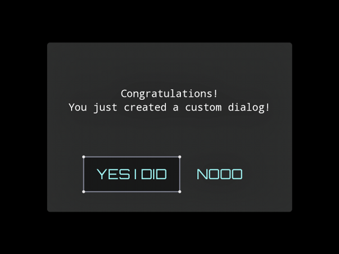
After you done all this you can open the modal and pass the options like shown bellow:
final CustomDialog cd = new CustomDialog("", skin);
da.text("Congratulations!\\nYou just created a custom dialog!")
    .buttonYay("YES I DID", new InputListener() {
        public boolean touchDown(InputEvent event, float x, float y, int pointer, int button) {
            // blow up the universe or just draw the pixels
            return true;
        }
    })
    .buttonNay("NOOO", new InputListener() {
        public boolean touchDown(InputEvent event, float x, float y, int pointer, int button) {
            // maybe some actions here?
            da.hide();
            return true;
        }
    })
    .show(stage); // you'll need a Stage instance :D
The Result Dialog
Leave a comment if you've got to a better solution for programmatic designing of Libgdx Dialog.
Maybe you're also interested in LibGDX Buttons using 9patch tutorial or check out Lines Galaxy Android game to view the results in action.
Categories: android, how-to, libgdx, texture-packer